12 Successful Product Marketing Content Examples That Hold Up
Most product marketing teams are tiny with just 1-5 people, but they’re somehow expected to ship content like they're a full agency.
I've watched teams try to keep up, and the math was never mathing.
Good news is that even a tiny team can do great with a library of good references and examples.
12 product marketing content examples
Apollo: Announcement Video
When Apollo dropped the announcement video for their new AI assistant, it was so good, that it was actually annoying for everyone else trying to do this.
The video opens with a bold declaration that their competitors’ GTM AI tools are just toys.
Call it confidence or arrogance, but either way, it works. You keep watching to see if they can back it up.

Starting with a sharp claim like this keeps people watching. Mr. Beast figured this out years ago with his micro build-ups and B2B product marketers should try it out too. Say something bold, then prove it fast.
The video also shows the product doing the actual work. I don’t have to tell you that B2B buyers don't care about innovation as much as they care about getting their Friday afternoons back. Tools that deliver on that get adopted immediately.
Another brand that did this really well with their announcement video is Caddy.
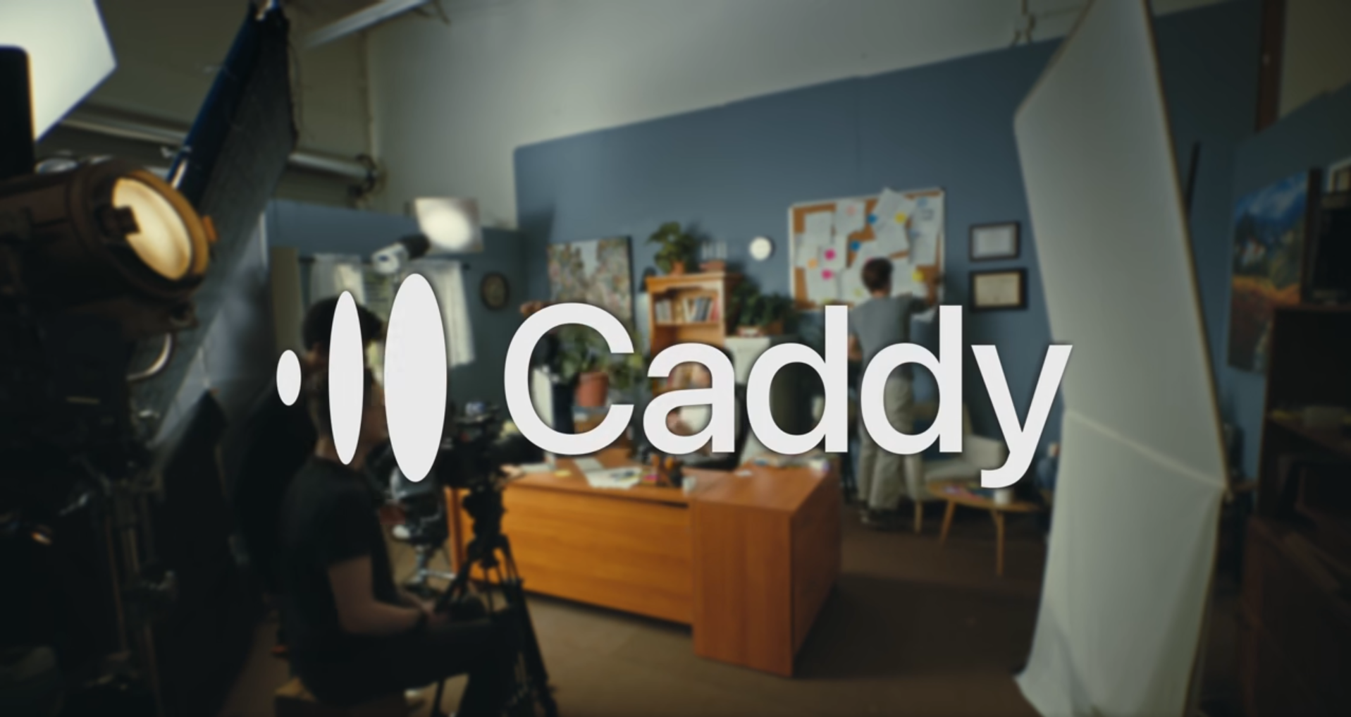
The production quality is high, but the product UI stays front and center. Don't bury the interface under motion graphics that look expensive but say nothing.
Last thing I love about the Apollo announcement video is that the CEO doesn't talk down to the audience or worship the product. He talks to peers.
When a feature is complex, you have to explain why it was hard to build instead of pretending it's simple.
When your feature doesn't work on mobile yet, say that you built for desktop first because that's where 80% of your users are, instead of pretending the mobile experience is coming soon.
That transparency beats a sales pitch every time because it sounds like someone who cares about the users and their experience.
Webflow: Landing Page
Webflow's homepage does something simple that most PLG homepages avoid - it lets you choose your starting points for exploration and then gets out of the way.
You see AI site builder, templates, or blank canvas. All three are supported with actual UI visuals instead of abstract illustrations of people high-fiving.
The page tells you what you can make and how much effort it’ll take at the same time, which compresses the gap between landing and deciding.
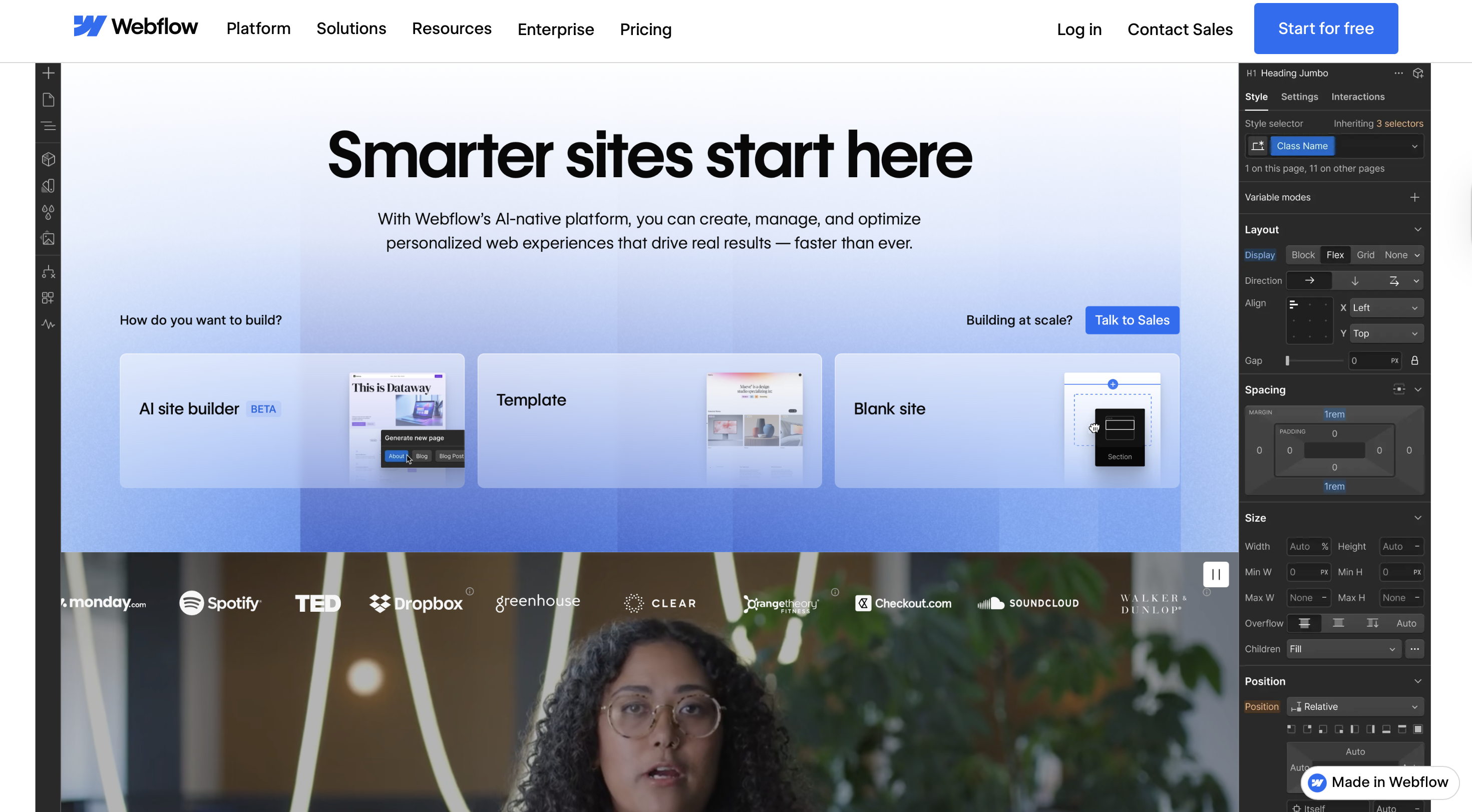
By naming the three paths immediately, Webflow forces you to pick one.
This is better than pretending every visitor wants the same thing or hiding options behind vague CTAs like Get Started.
The idea is straightforward:
- Lead with the benefit
- Show the actual paths someone can take
- Use real product visuals and direct copy
What makes this work isn't the design budget but the control over the path.
And it works because Webflow knows who's looking at it.
Webflow mapped the primary routes users actually take, then anchored each one in a real UI moment.
High-performing product marketers map assets to personas, not funnel stages.
A CTO evaluating your product doesn't care about the same path as a growth marketer running experiments. Show them different entry points.
Sisense: Product Walkthrough Video
Sisense made a product walkthrough that doesn't make you want to close the tab, which is a low bar that most B2B companies still trip over.
Most product walkthroughs fail because they try to serve two audiences at once: people evaluating the product and people ready to use it.
Sisense picked one. They made a video for evaluators who need to understand the value prop in 90 seconds.
Unqualified viewers self-select out early. If you're watching this video and thinking that you don't need data visualization, you leave. That's the point.
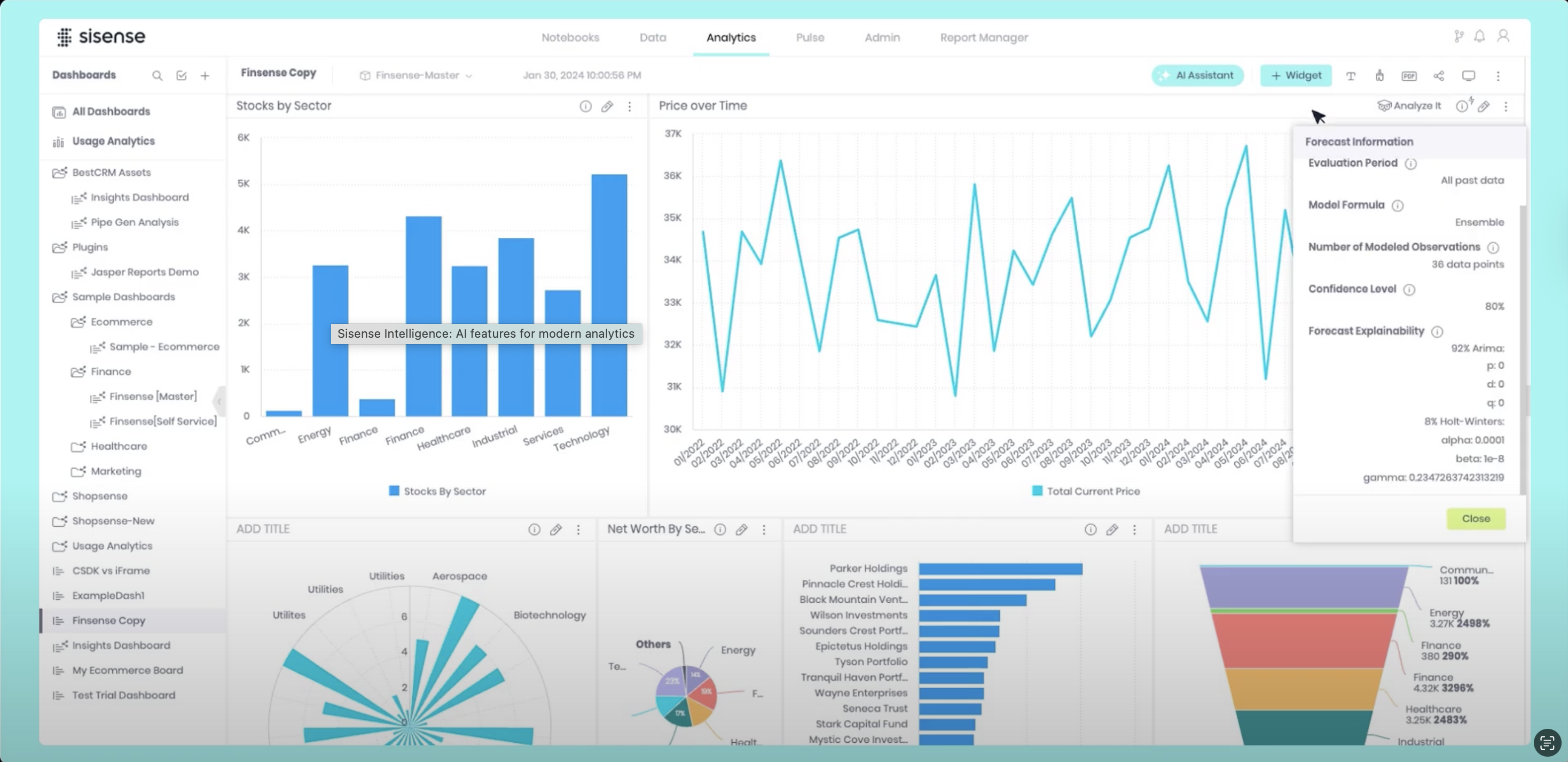
One tactical detail worth stealing is that Sisense uses almost no text overlays. When text appears, it's a button label or a data point, not an explanation.
Also, note how they start with the outcome, a completed dashboard. It's a test for whether your product positioning works.
If your walkthrough needs to explain why someone should care before showing them the end result, you're covering for positioning problems.
The product should speak for itself when it's done. If it doesn't, fix the positioning before you record the video.
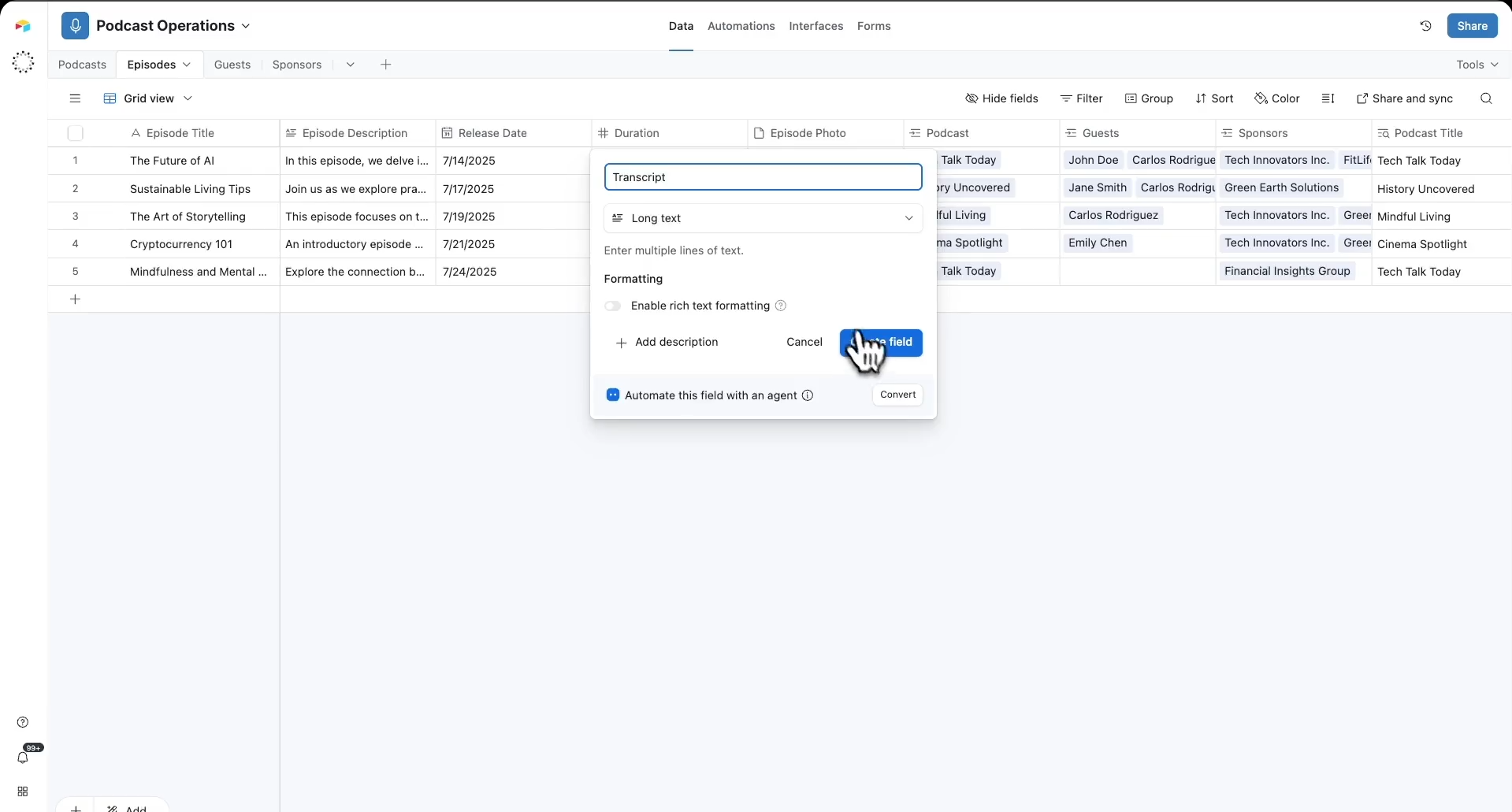
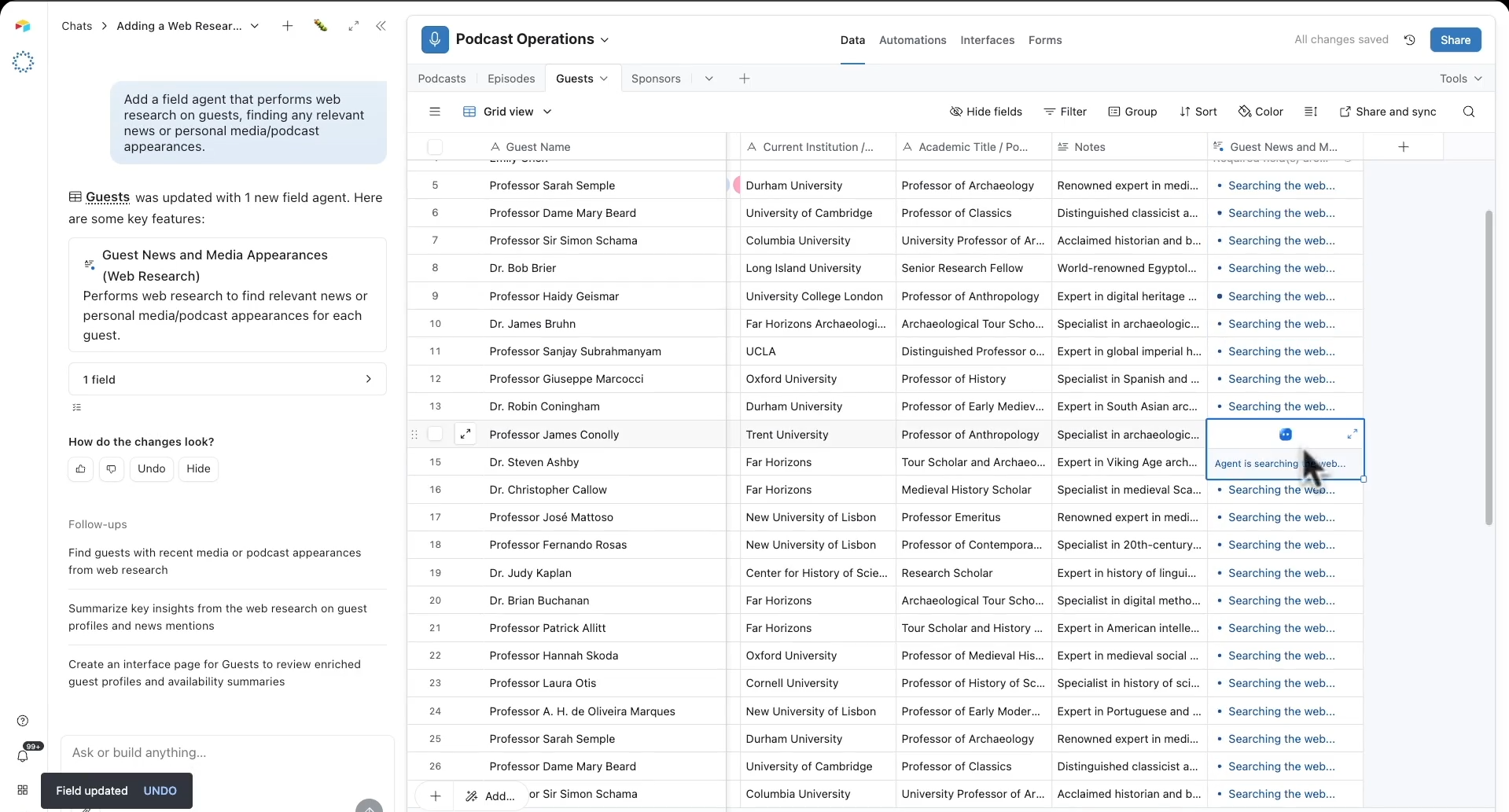
Once you’re ready with your positioning:
- Click on the Hexus Chrome extension.
- Choose Record Interactive Demo for a click-by-click flow or Video Recording.
- Click start and go through the workflow as if you're explaining it to someone looking over your shoulders.
- Once done, click the extension again and stop the capture.
AI will split the recording into logical steps with hotspots and callouts for the interactive demo.
ClickUp vs Notion: Comparison Page
If you search for ‘clickup vs notion’ in your favorite search engine or Bing, you’ll find both companies are doing real positioning inside the SERP itself.
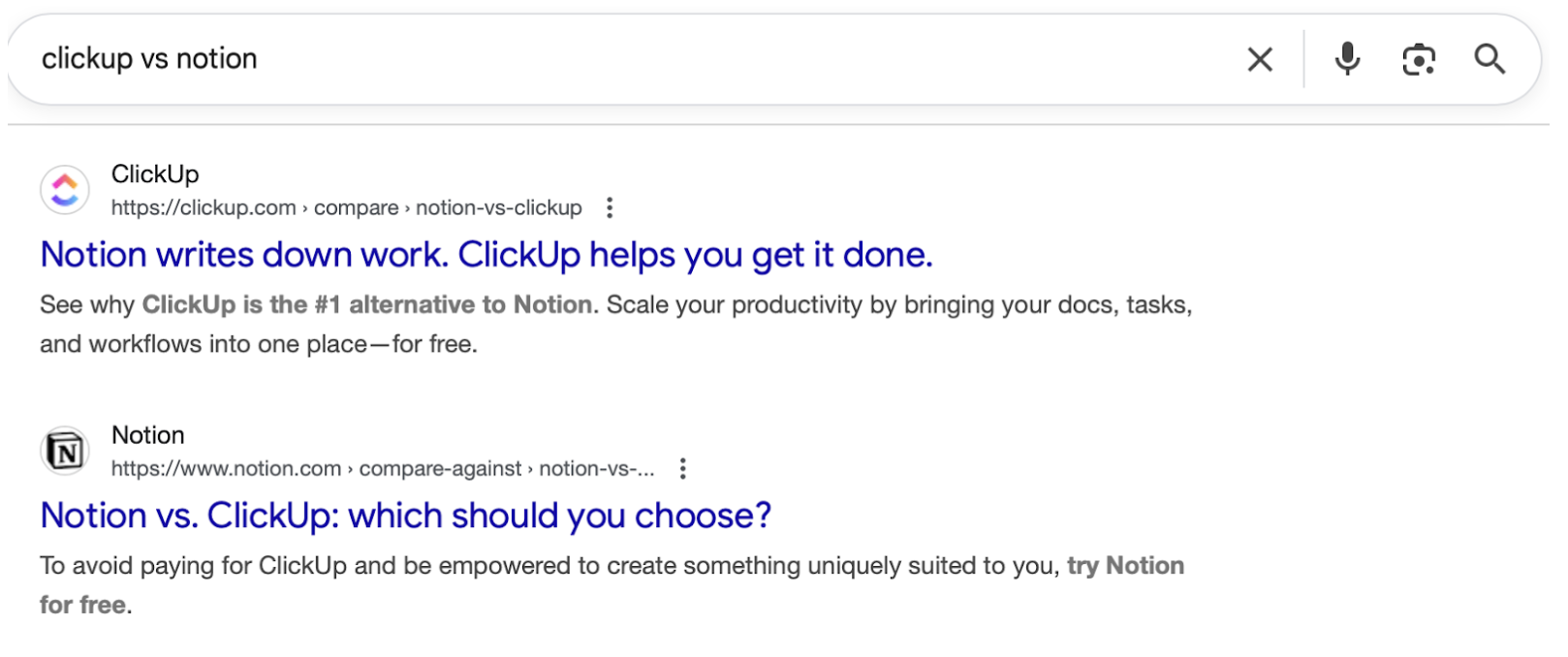
Each brand is telling you how to think about the category BEFORE you ever land on a page designed to convince you.
Clicking through to the Notion vs. ClickUp comparison page on ClickUp’s website, you’ll see that ClickUp doesn’t trash Notion.
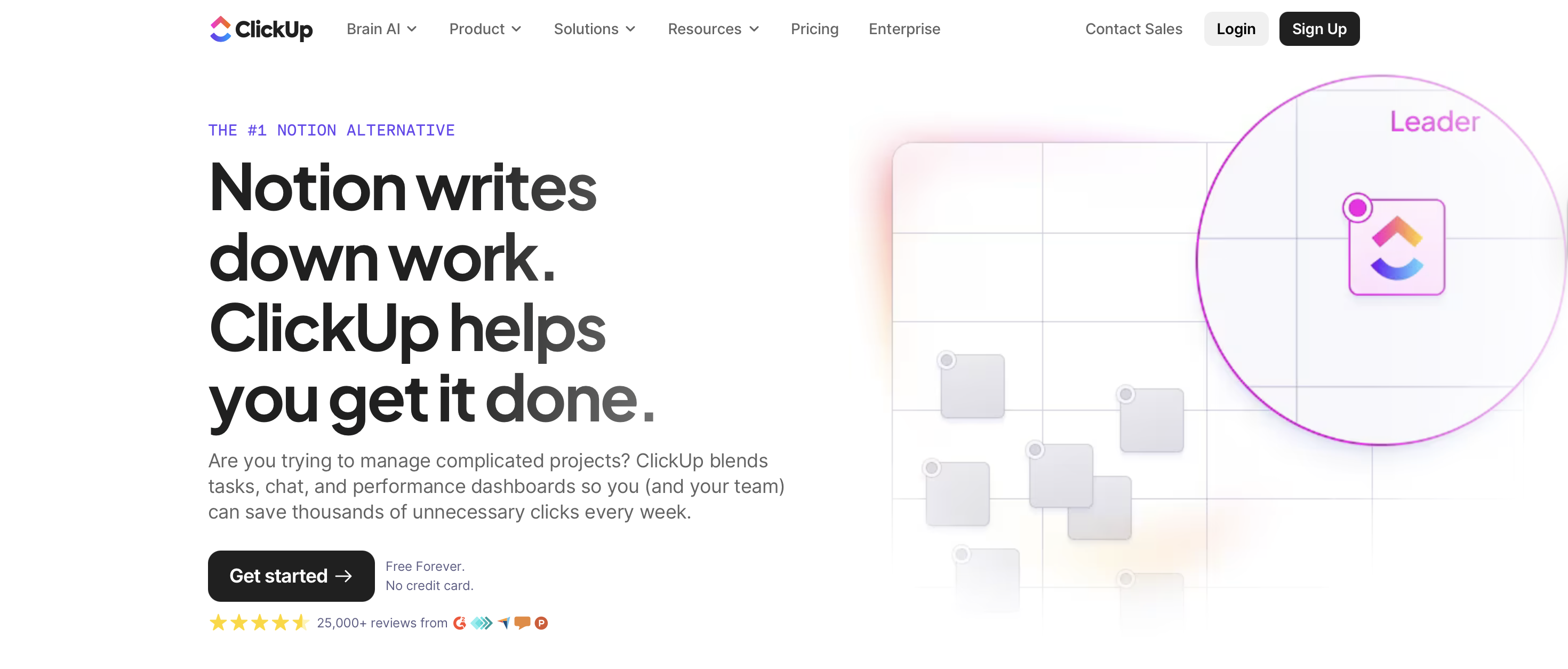
Trashing competitors makes you look defensive. Acknowledging their strengths makes your differentiation credible.
Rather than spiraling into feature-by-feature drama, the page anchors the comparison around use cases and workflows. This is important because B2B people buy for use cases and benefits, not features that enable those.
There’s also a refreshing absence of the usual comparison-page clutter like massive tables daring you to read every row and fake neutrality followed by a dramatic reveal that, shockingly, one product is better at everything.
The structure is simple, scannable, and mercifully aware that the reader has limited patience and a meeting starting in five minutes.
Comparison pages like these that feel less like persuasion and more like orientation help users arrive at a conclusion on their own and get conversions fast.
Circle: Community ROI Calculator
The calculator page from Circle is a great example of product marketing content that reframes how you think about a solution.
Instead of leading with features or platform capabilities, the calculator makes you think what your community could be worth, long term. And this small mental shift toward outcomes disarms you.
Once the page shows you a number with commas in it, their target audience is evaluating a possible version of their community.
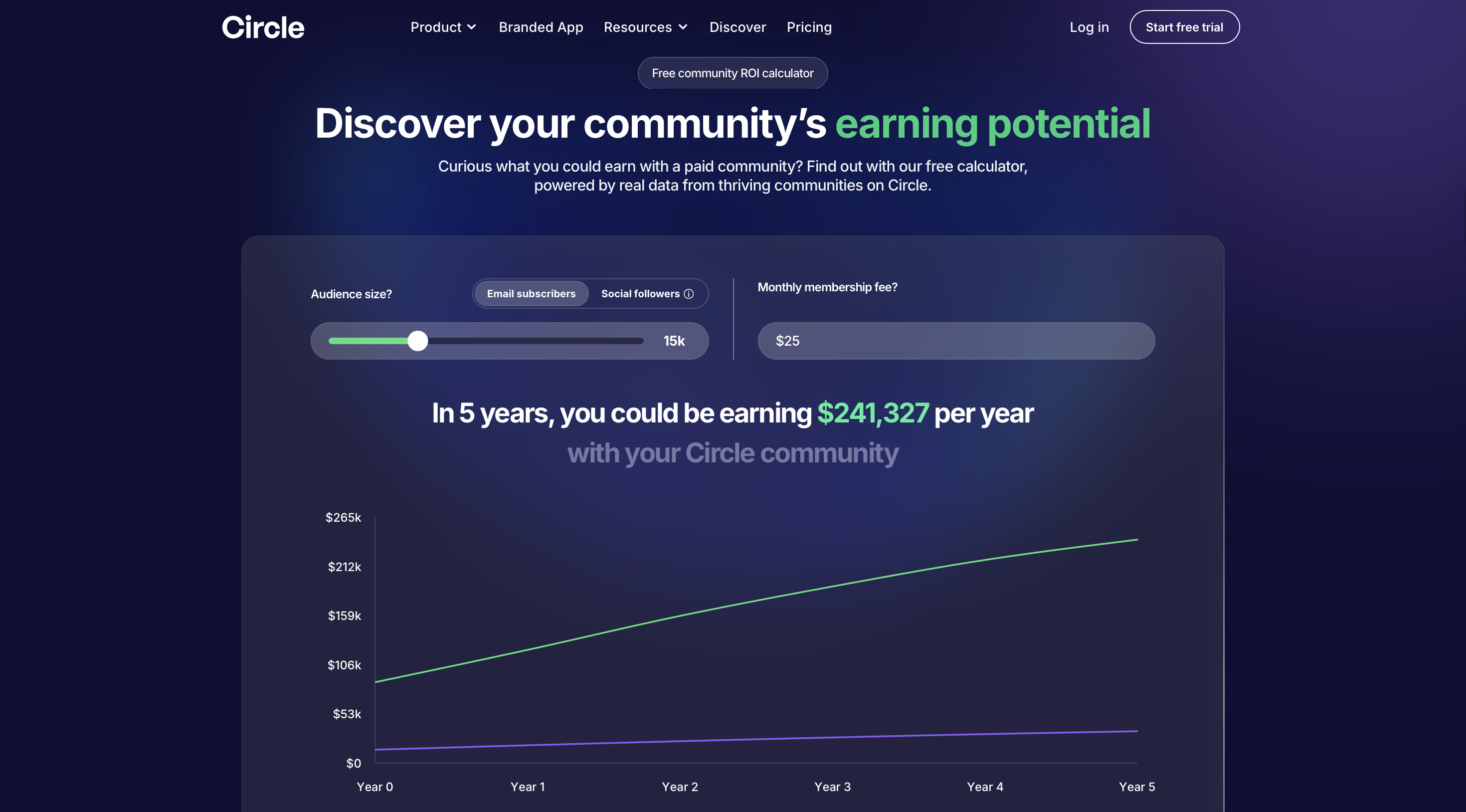
What makes this especially effective is that Circle doesn’t rush past that moment.
The page takes time to explain how the calculator works, what assumptions it makes, and where its limits are.
This is an unusual move in SaaS marketing, where most tools prefer a little mystery and a lot of optimism. By showing its math, Circle earns the right to be believed, and that credibility carries through the rest of the experience.
From there, the page widens its lens. It stops talking about your specific number and starts talking about what recurring revenue changes in practice.
They use real stories and simple truths to provide reassurance that’s very much in context of the target audience. The product is still largely in the background.
Only near the end does Circle step forward and says here’s how we help make it real. By that point, the product introduction feels like a logical conclusion to a thought process the reader has already completed on their own.
For product marketers, this is a strong reminder that the most effective content starts by reshaping how the buyer understands the problem, the opportunity, and the trade-offs involved.
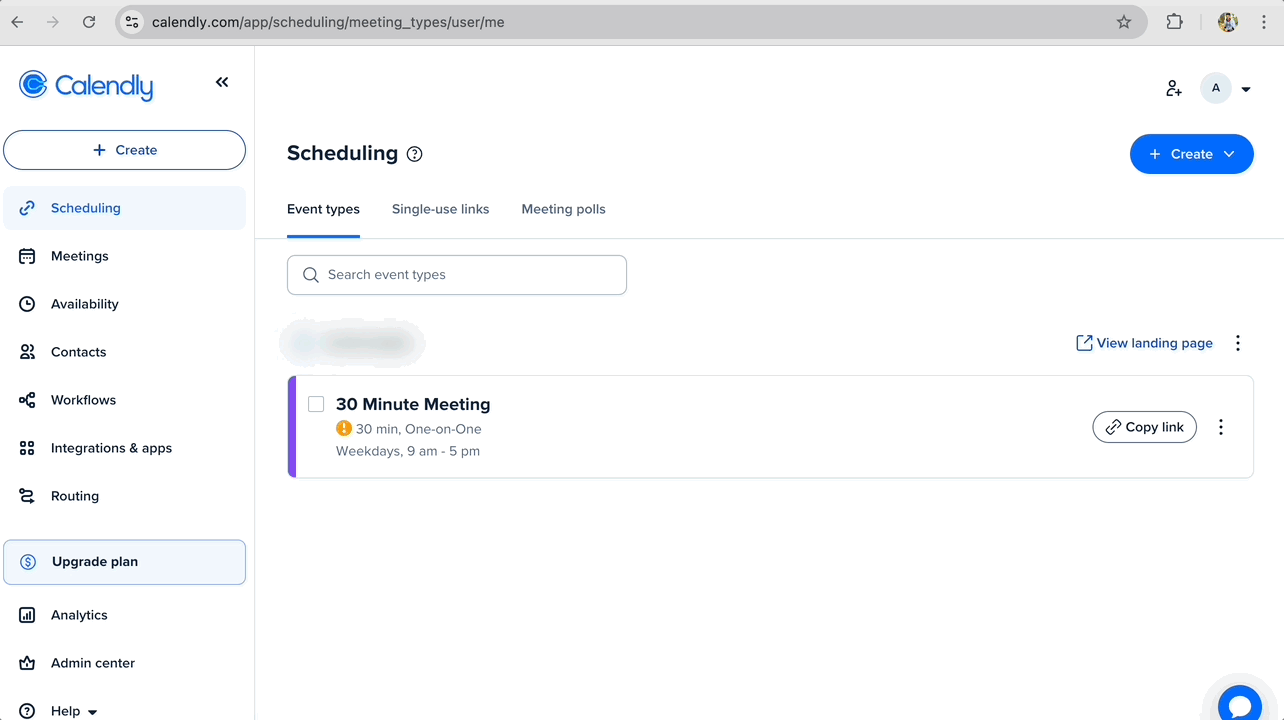
Calendly: Feature Explainer Video
Calendly has a short feature explainer video showing how the software removes the back-and-forth of scheduling.
Scheduling meetings is still somehow exhausting in the year we have self-driving cars, and Calendly’s feature explainer video doesn’t try to overthink that fact.
It simply starts where the frustration already lives and shows, step by step, how the product makes it go away.
The video unfolds in a clean, almost boringly logical flow. But it’s exactly what’s needed. From content like this, existing users and potential customers just want to quickly know how the feature works for their use case.
It assumes the audience is busy and respects that by making the value obvious without effort.
And for that, the visuals do a lot of heavy lifting here. Calendly uses simple motion graphics with quick, focused product shots and makes everything stupidly easy to understand.
What makes this especially strong as product marketing content is its restraint.
The video resists the urge to branch into edge cases or advanced workflows. It stays locked on a single pain point and a single outcome of finding time without wasting time.
The viewer doesn’t need to do a lot of thinking and can easily absorb that singular takeaway, which is exactly what you want from a feature explainer.
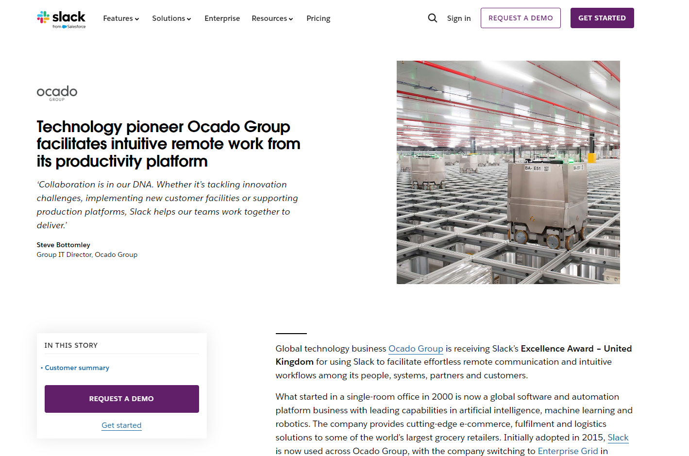
Slack: Case Study
The case studies from Slack are a good reminder that customer stories don’t have to feel like required reading.
They’ve clearly spent time thinking about how people actually look for proof, which is why their case study library behaves less like a brochure and more like a filterable reference tool.
One strong example is Slack’s case study on Ocado Group, which focuses on how the team improved remote productivity by reducing long meetings and leaning into asynchronous communication.
The story doesn’t float at the level of abstract, jargon terms like ‘better collaboration’ or ‘improved alignment’.
It gets specific by showing the readers what changed, why it changed, and what the outcome was, without them having to fill in the gaps themselves.
Slack also does a nice job closing the loop between story and product. As the case study mentions Clips, Threads, Channels, and Workflow Builder, those features are directly linked, making it easy for curious readers to move from outcome to mechanism without breaking context.
The story shows the value, and the product pages explain how it happened.
That said, this format can still be pushed further by adding a demo of the workflow:
- Record workflow demos directly using the Hexus Chrome extension.
- Turn those recordings into short videos or annotated guides with AI features.
- Add product visuals like screenshots, process diagrams, and before-and-after comparisons.
Instead of imagining how a team uses Threads or Clips, readers can watch it happen.
Miro: Onboarding Guide
The onboarding guide from Miro is a good example of what happens when onboarding content is designed for how people actually learn, not how products wish they were explored.
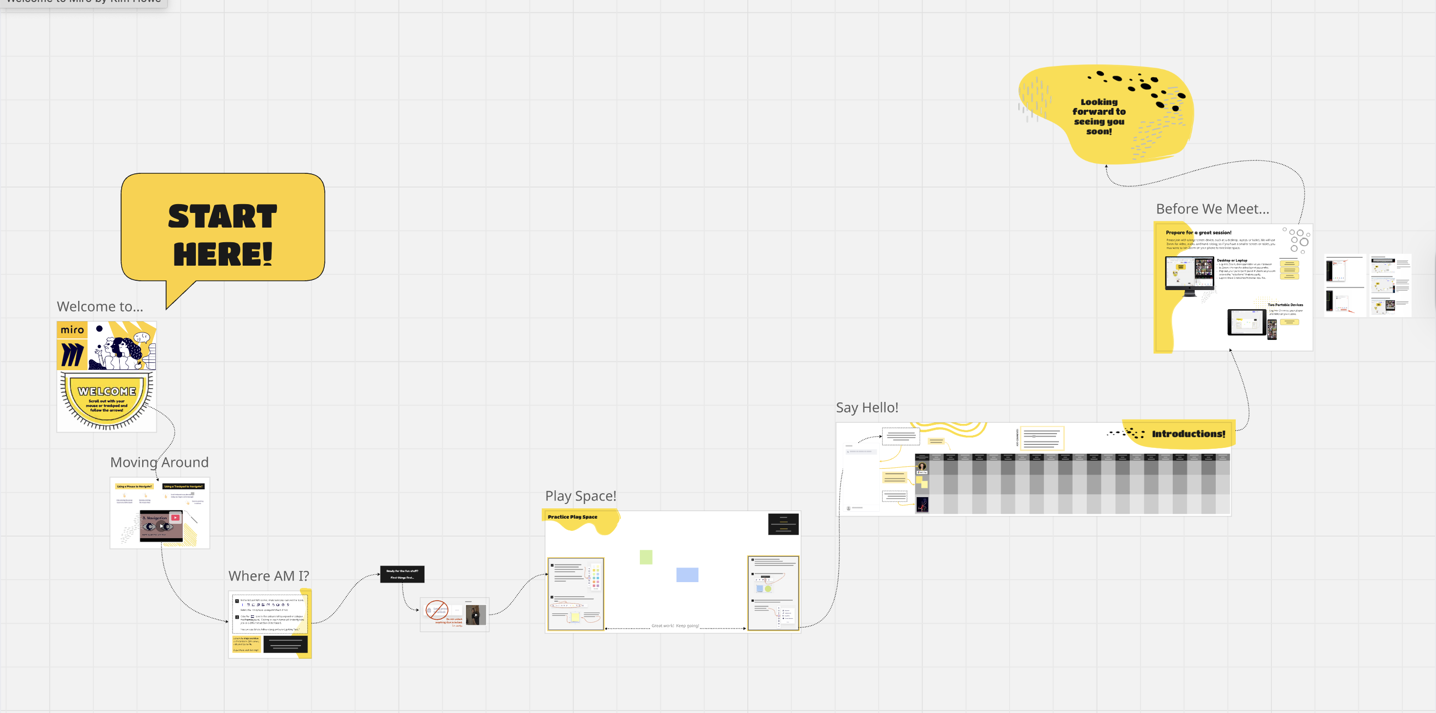
Instead of throwing first-time users onto a blank canvas and hoping curiosity does the rest, Miro breaks onboarding into a sequence of guided experiences.
The guide doesn’t assume the user wants to master the entire product on day one. It assumes they want to feel oriented, capable, and slightly less lost than five minutes ago.
What works especially well is the structure. Each onboarding step is framed as a discrete entry point with a clear purpose, whether that’s getting familiar with the canvas, experimenting in a sandbox, or learning how to collaborate with others in real time.
Instead of long explanations, Miro relies on actual boards, real examples, and embedded interactions that let users learn by doing rather than reading.
You’re shown what it does by being placed directly inside it. The onboarding content and the product experience are essentially the same thing.
Pairing these with short annotated walkthroughs would make it even easier for teams to reuse onboarding content across docs, emails, and internal enablement. In your Hexus demo editor:
- Go to Call to Action > Hotspot Type.
- Choose Hotspot Type: Callout and Walkthrough
- Preview changes in real time
- Customize headings, descriptions, and even buttons for each walkthrough.
Gumloop: Interactive Demo
This interactive demo built around Gumloop is a strong example of how product marketing content can teach without lecturing and guide without overwhelming.
What makes the demo effective is that it doesn’t start by explaining Gumloop as a platform. It starts by showing a job getting done.
You’re walked through building a workflow that searches the web for relevant articles, extracts what matters, categorizes the information, and delivers it somewhere usable.
The product fades into the background while the outcome stays front and center.
The walkthrough itself is deliberately minimal. Each step is surfaced only when it’s needed, with short prompts pointing out what to add and why it matters.
The demo excels as product education by letting users experience Gumloop’s capabilities in context.
When users finish the demo feeling capable rather than impressed, the content has done its job.
Shopify: Help Docs
The help documentation Shopify has for migrating from Etsy gets the intent right.
This page is clearly designed for users who are already in motion, trying to do something specific, usually under mild stress, with a store that is very real and very live.
The doc doesn’t interrupt that moment with marketing language or feature detours.
It stays focused on helping the user complete the task in front of them, step by step, without editorializing.
The structure does most of the persuasion.
Each section is scoped tightly around a single action or decision, with clear prerequisites, expected outcomes, and visual confirmation of what success looks like.
Screenshots are used to reduce uncertainty. When the doc says ‘Click this’, the user can see exactly what ‘this’ looks like, which lets the user know they’re doing the right thing.
Instead of flattening everything into a single linear flow, the doc branches when it needs to.
Optional paths, edge cases, and advanced considerations are clearly separated, so beginners aren’t overwhelmed and experienced users aren’t slowed down.
As users move through the steps, they’re implicitly learning what Shopify can handle, how flexible it is, and where control lives in the interface.
Airtable: How-to Video
The how-to walkthroughs from Airtable understand that once users get past the initial onboarding, they need to know how to do the specific thing that brought them here, preferably without having to learn an entirely new vocabulary first.
In the Airtable beginner’s guide video, instead of introducing the platform in broad strokes, they drop beginners straight into a concrete outcome, like building their first AI-powered app from the dashboard.
The walkthrough starts wide, giving users a sense of the interface as a whole, then progressively narrows its focus section by section as tasks become more specific.
Only the elements required for the next action are labeled, which keeps the need to think about stuff low and momentum intact.
Airtable doesn’t front-load terminology or configuration details. It lets users succeed with something simple first, then introduces complexity only when it naturally becomes relevant. The learning experience feels paced rather than compressed.
Pro tips appear exactly where questions are likely to form, rather than being buried at the end or surfaced too early.
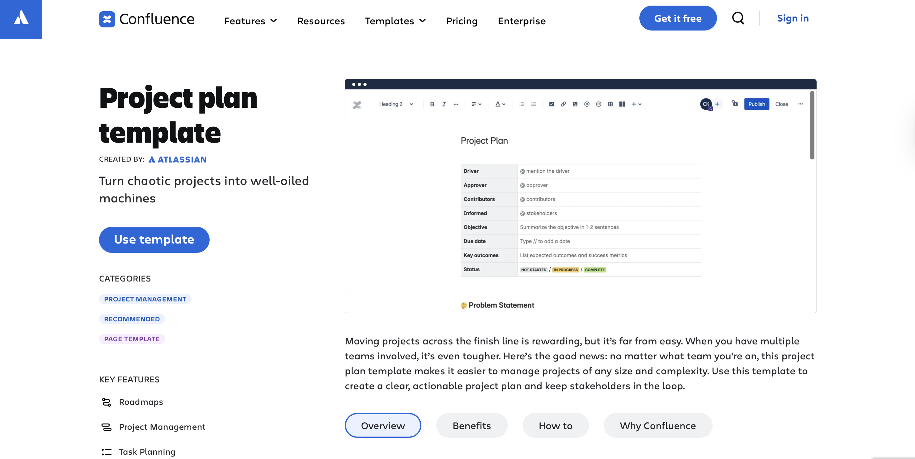
Confluence: Templates
Templates are funny in the sense that they’re ToFu content but they're also product features.
If you treat them purely as lead magnets, you optimize for email capture and end up with people who downloaded something they'll never use.
If you treat them as product features, you optimize for actual usage and end up with people who find them valuable enough to start or keep using your product.
Confluence is a blank canvas product.
Blank canvases have high flexibility and high activation friction.
Templates reduce that friction by giving you a starting point, but they also expand your product's surface area.
Someone searching for a project plan template finds this page and becomes a Confluence user without ever seeing Confluence's homepage or understanding what Confluence is.
When recreating this kind of product marketing content, the fastest way to ruin it is to get ambitious.
Templates fall apart when they’re stuffed with “nice to have” sections that dilute focus, or when labels become so abstract they require interpretation.
A thing I love about this template is that it’s filled with realistic content. You see what your project plan will look like when it's done.
Most templates show you an empty structure and make you imagine what it could be.
Obviously, the template format will depend on what your product is about. An automation tool’s templates will not be in written style.
But no matter what kind of template you create, you have to show people a complete, realistic example of what they'll create with your product, not an empty structure they have to figure out themselves.
Final thoughts
I went through all of these examples with the same energy you bring to reorganizing your desktop when a blog post is due 👀
What I learned is that good product marketing content doesn’t have to be very polished, smarter than all the content you’ve ever produced, follow a framework, have a big budget, or even be that impressive.
But it for sure needs to show up EXACTLY when someone is trying to decide something.
If you take anything from these examples, let it be that. When your content can do that consistently, it’ll start pulling its weight and supporting your GTM motion in a massive way.
Also, you’ll spend less time rewriting the same asset, which is the real dream.
How Hexus helps with Personalization
More Articles
.png)
.png)