12 SaaS Product Tour Examples to Get Inspired By
Most products need a mix of onboarding, feature education, sales demos, and internal training as they grow.
Great product tours do all that, stop users from getting lost, and prove your value before they have a chance to quit.
I’ve rounded up 12 product tour examples to show what goes into their making.
1. Slack
Type: Sandbox demo
Use case: First-time onboarding
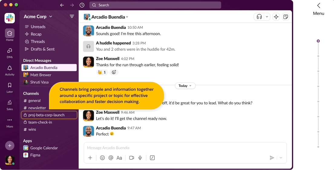
An empty Slack workspace is a lonely, confusing place.
Without teammates, messages, or shared files, it is hard to understand why the product matters. Communication tools depend on activity, and new users arrive without any of it.
Slack solves this by removing the waiting altogether. At slackdemo.com, users land inside a workspace that already looks lived in.
They skip the setup and jump into a workspace that’s already alive with channels, messages, files, and bot integrations.
What's good?
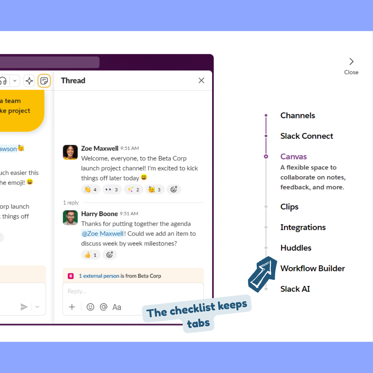
- Uses a checklist to control how guidance appears. Users can replay, skip, or focus only on the features relevant to them.
- Showcases the Day 100 value on Day 1. You see Slack organizing a busy workday even before you start using the platform.
- Entire product tour is divided into several short tours. Each one only guides what’s relevant to that user.
If your product depends on activity, data, or collaboration, a blank state will work against you. A realistic sandbox lets users understand the product without waiting for it to fill up naturally.
The drawback here is that Slack relies heavily on text-heavy callouts. This isn’t the best UI practice as it overwhelms users. But still, if your users would benefit from more context, there are other better ways.
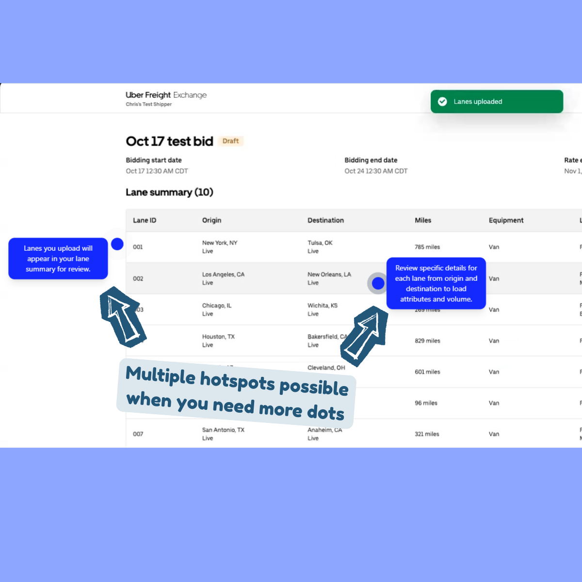
2. UberFreight
Type: Interactive product guide
Use case: Activation for complex features
UberFreight sits squarely in the world of logistics math, with technical features that involve setting up things like rates, lanes, bids, availability, timing.
The product is powerful, but the workflows are dense.
So instead of one giant onboarding tour, UberFreight focuses this one on a single action that matters most: booking a load.
What's good?
- Text and voice share the load. On-screen tooltips handle the mechanics and AI voiceover carries the explanation allowing users to skim, listen, or do both. That flexibility lowers friction for different learning styles.
- Rather than dragging users through step after step, the tour uses hotspots and tight copy to explain three key elements in a single view. That results in fewer transitions and mental context switching.
- Using voiceovers instead of text-heavy copy for CTAs is a smart move.
When features are complex, scope is your sharpest tool.
Teach one thing and teach it well so you can get users to the moment they came for.
3. Qwiet AI
Type: Interactive product tour
Use case: Onboarding for complex, technical products
Qwiet AI is an AppSec tool built for developers, which already sets the tone.
Developers tend to be impatient with onboarding. They don't enjoy pop-ups that interrupt their work, long videos that explain the obvious, or marketing copy that talks around the point.
They want to understand the product quickly and move on.
Qwiet AI responds to this by using a walkthrough modal. Instead of scattering small callouts across a dense dashboard, the product opens a focused overlay that guides users through the experience.
The interface stays in the background while the explanation takes the lead.
What's good?
- Assumes the user knows what they are looking at. It doesn't stop to explain basic terms or interface patterns. Because of this, the user can follow the narrative without scanning the screen for highlighted elements.
- Walkthrough modal gives users control. They can move forward, go back, or pause without losing their place. This makes the tour feel more like documentation you can step through than a guided interruption.
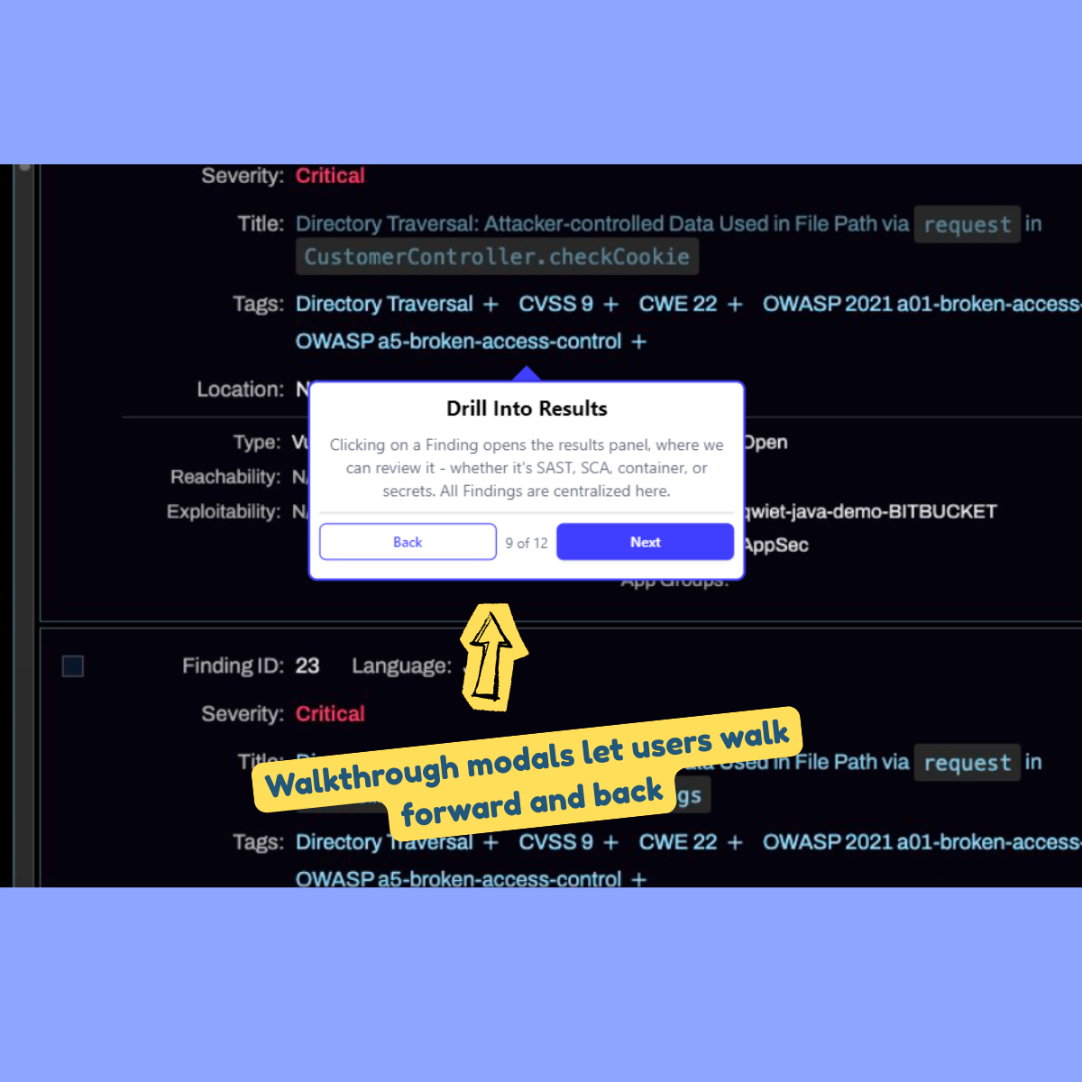
- At 11 steps, it's long enough to explain the product but short enough that users can finish it in one sitting without dropping off.
Some products need space to explain themselves.
When the value comes from understanding concepts rather than clicking buttons, a walkthrough modal works better than scattered callouts.
If building that structure feels like work, starting from a screen recording and letting AI turn it into a walkthrough can reduce the effort without changing the outcome:
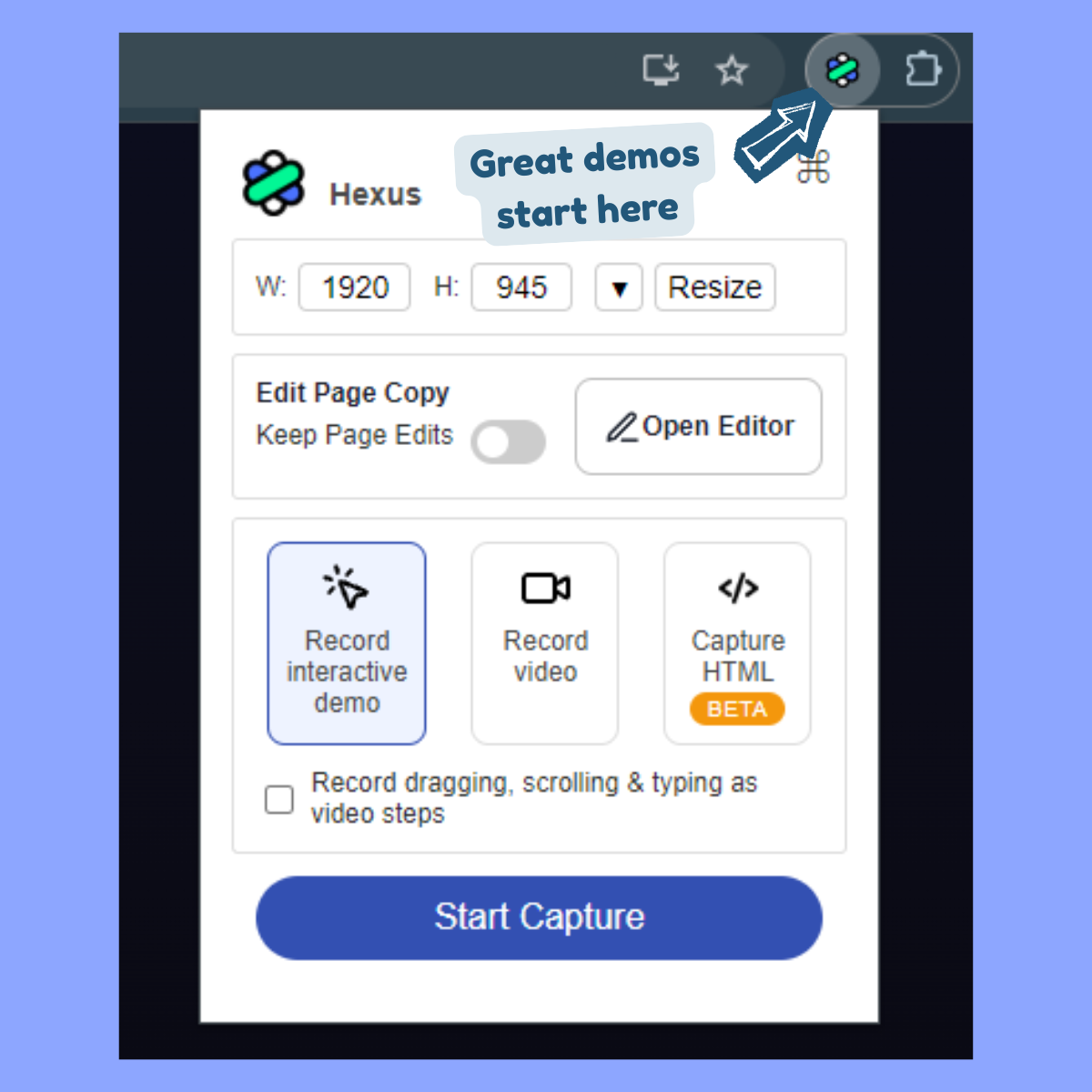
- Click on the Hexus Chrome extension.
- Choose Record Interactive Demo for a click-by-click flow or Video Recording.
- Click start and go through the workflow as if you're explaining it to someone looking over your shoulders.
- Once done, click the extension again and stop the capture.
AI will split the recording into logical steps with hotspots and callouts for the interactive demo.
4. Hexus
Type: Interactive product tour
Use case: First-touch value discovery
The product tour for Hexus lives directly on our homepage.
Instead of explaining what the platform does, the tour shows you how it works by walking through a real workflow.
What’s good?
- Uses a thoughtful mix of visual highlights and hotspots, short text callouts, and voiceover. Together, they mimic how a teammate would walk you through the product on a call.
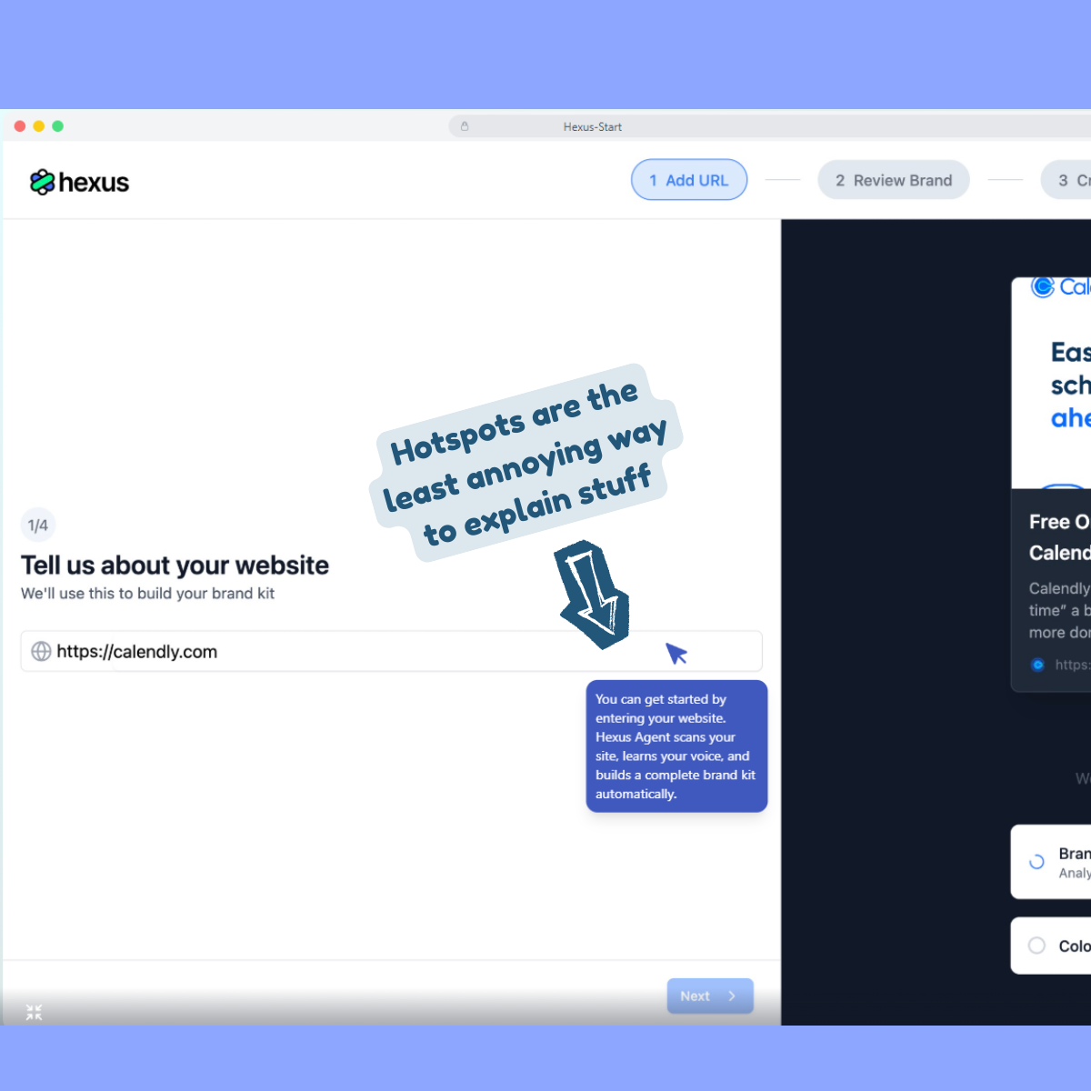
- 30 seconds in, you see how Hexus uses AI to turn raw screen recording into polished product tours and the outcome isn't left to imagination.
- Moves in a tight sequence and there's no attempt to show you everything. Each step exists only because it leads to the next one.
Product tours are easier to follow when they begin inside real work. Pick one or two core actions that demo immediate payoff and build the tour around those.
If users can see the outcome early, they’ll stick around long enough to learn the rest.
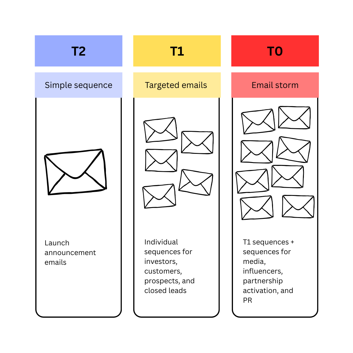
5. Sprinklr
Type: Gated product tour
Use case: Lead gen
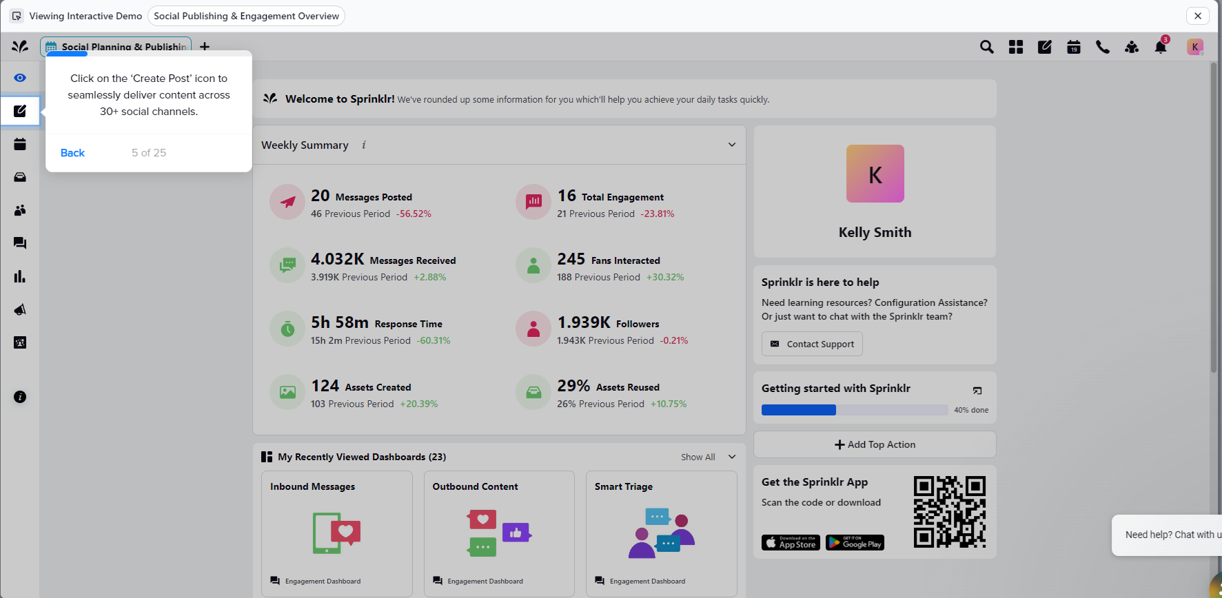
Sprinklr is a massive platform with 30+ distinct products. But they don’t have a free trial, freemium tier, or sandbox environment.
So instead of pretending the platform is easy to grasp in one sitting, Sprinklr does something smarter. They use bite-sized demos to let users experience the platform.
What's good?
- By breaking the suite into smaller tours, Sprinklr avoids the classic enterprise trap of showing everything and explaining nothing.
- The tours are intentionally gated to qualify interest. Only users who are genuinely curious make it far enough to unlock the full experience.
- Even more interesting, instead of gating immediately, Sprinklr lets the first few steps do the selling. Users see value, context, and relevance before being asked to share details. This creates a psychological pull. If users have already invested attention, they’re far more likely to finish and convert.
If your goal is SQLs, not vanity demo views, gate with intent.
Gated tours work best when users feel they’re unlocking something valuable, not paying a toll to keep walking.
6. Apollo.io
Type: Voice-led interactive product tour
Use case: Onboarding for complex, role-specific workflows
Apollo lives in a technically dense neighborhood with features like sales intelligence, enrichment logic, filters, sequences, signals.
It’s the kind of product where every concept comes with jargon baggage. So instead of turning the UI into a wall of instructional text, Apollo decided to lead with voice.
The tour pairs lightweight hotspots with AI narration that explains why you’re doing something, making it easy for you to follow without context-switching between reading, clicking, and decoding acronyms.
What’s good?
- Voice absorbs complexity better than text, making long explanations feel lighter when they’re spoken. For technical flows, voice guidance reduces fatigue without dumbing anything down.
- Users don’t have to stall out reading dense copy that’s on screen. They can move, listen, and learn in parallel and finish this long tour fast.
- Apollo calls out the persona and context immediately, which keeps the right audience glued and builds instant trust with them.
If the concept is complex, let the interface show what to do and let audio explain why it matters. Here’s how you can do it with Hexus:
- After you’ve finished recording a demo, click on Speech & Video > Text-to-speech in edit mode.
- Write your script for the screen. Add pauses to make AI voices sound natural.
- Choose from 30+ AI voices in different genders, language, and tone.
- Play around with advanced settings to dial in a voice that explains clearly, flows naturally, and doesn’t sound like it’s reading documentation out loud.
- Click on Generate Speech

Now layer that audio over:
- Hotspots for key actions
- A short, focused step flow
- Clear entry intent (who this tour is for)
You’ve got yourself a tour that teaches without lecturing.
7. Loom
Type: Human-led video walkthrough
Use case: Just-in-time troubleshooting and support education
Not all tours are meant to give you a ride. Some are also there to help you troubleshoot a problem. Take this Loom product tour as an example.
Instead of sending users to dense help docs, it uses its own product to answer a simple but common question on how they can share a (Loom) video.
What's good?
- 30 seconds in, users learn exactly how to share a video with teammates. Value arrives FAST.
- Seeing a team member’s face in the corner turns the experience into a 1:1 explanation.
- Once the core question is answered, the video naturally extends into adjacent use cases like sharing on social, embedding on a website, sending via Salesforce, which is optional extension for users who might want more.
Interactive tours are great for learning but video tours are unbeatable for fixing.
When users are stuck, don’t make them click through steps. Show them the answer, quickly, and preferably with a human voice. That’s often all they need to move forward.
8. Ministry Brands
Type: AI avatar-led interactive product walkthrough
Use case: Onboarding for non-technical users
Ministry Brands builds software for faith-based organizations. Their core users are church administrators and pastors.
A cold, text-heavy tour would miss the mark entirely.
So instead of burying users under tooltips, Ministry Brands puts a (somewhat) human face, an AI avatar, that explains the product out loud.
What’s good?
- Recreates hand-holding without being patronizing. For users who aren’t deeply technical, the avatar sets a calm pace and removes anxiety from exploration.
- AI avatars change the emotional temperature of the product instantly. The software feels a little less abstract and a little more approachable.
- Voice, visuals, and interaction are layered so that nothing competes for attention or overwhelms the audience.
Don’t try to be impressive with your onboarding tours, be reassuring.
If your users value clarity, warmth, and guidance over speed and power, soften the technology.
Let a human or human-like guide do the explaining. And when you’re not ready to be on camera, an AI avatar is a surprisingly effective stand-in.
Here’s how:
- Open your Hexus project in edit mode and click on Speech & Video.
- Choose your preferred AI avatars, Hexus has 20+ ready-to-use AI faces. We also integrate with HeyGen so you can import your AI avatar into Hexus from there, if you got one.
- Enter the script for the avatar, then drag and resize the avatar to a spot of your liking on the screen.
- Click on Generate Preview to check the sync, then hit Publish to see the full animation in action.
9. Dropbox
Type: Interactive product demo
Use case: Churn prevention
Dropbox uses interactive product tours to keep users from getting stuck, especially in critical moments.
Login issues are a classic churn trigger in B2C products.
So instead of sending users to long help articles, Dropbox walks them through the solution visually.
The goal is to resolve the issue before frustration turns into a support ticket.
What’s good?
- Static help articles rely on interpretation. For procedural tasks like this, watching the steps unfold is faster than reading them. There’s less interpretation and fewer mistakes.
- Login problems happen before users even reach the product. By guiding users visually, Dropbox removes anxiety early, when patience is lowest.
- Branching is handled visually. Users self-select into the correct flow - ‘Continue with Google’ or email-password login flows - and immediately recognize their path, instead of wondering if they’re in the wrong place.
Visual clarity beats written instruction, especially when users are already frustrated.
For common, high-friction issues, guided product tours resolve problems faster than tickets ever will.
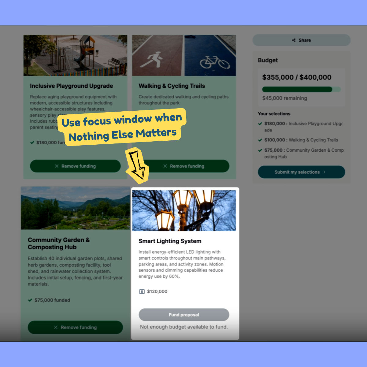
10. Civio
Type: Self-guided video demo
Use case: Top-of-funnel education and feature awareness
Civio explains public finance to a mixed audience of government officials, journalists, and citizens. Not everyone arrives curious.
So Civio leans into a self-guided video tour to introduce its Budget Tool.
What’s good?
- Instead of showcasing the entire platform, the tour highlights the 10 percent of the interface the user needs right now. This makes it more shareable and relevant to embed in help pages, landing pages, and documentation.
- Because the tour is voice-first, it’s also more accessible for visually challenged or low‑intent visitors. If a lead wants a quick overview without interacting, this format delivers.
- Rather than static callouts, Civio uses focus windows to isolate the active area of the screen. This feature makes sure that while the viewer is watching the video, their attention is still being directed with intention.
Video tours work best for top-of-funnel awareness.
They’re low-effort and low-friction. But that doesn’t mean they need to be stale.
You can experiment with different types of interactive elements, like focus windows. Here’s how:
- Open your Hexus project in edit mode and click on Step Settings.
- Enable Focus Window, and then resize, drag, and drop the window to the right position.
- Do this for as many steps as you want.
- Hit publish.
Use video for narrative and focus windows for attention control. You get the clarity of a demo video with just enough interactivity to keep users engaged.
11. Sider.ai
Type: Interactive product walkthrough
Use case: Activation
Sider.ai introduces itself by solving a problem you already have. In this tour, that job is to turn a PDF into a quiz.
What's good?
- Anchored to a single use case. The flow never drifts into explanation for explanation’s sake, which keeps activation front and center.
- Only the core capabilities required to complete the task are shown. That restraint helps users remember what actually matters.
- Each step stays under 30 words. AI voiceover handles continuity and the text stays crisp which results in the users never feel buried.
Modern product tours work best when they solve a problem first and explain the product second.
Deciding between hotspots and a boxed walkthrough usually requires seeing both in context. In Hexus, switching between the two doesn’t mean rebuilding the tour:
- Go to Call to Action > Hotspot Type.
- Choose Hotspot Type: Callout and Walkthrough
- Preview changes in real time
- Customize headings, descriptions, and even buttons for each walkthrough.
12. Sudowrite
Type: Guided product tour
Use case: Activation and onboarding
Sudowrite helps authors, screenwriters, and creators overcome writer’s block.
So instead of introducing features, the activation and onboarding tour walks users straight into the creative process itself.
They help you learn about Sudowrite by making you experience the product itself, which is what all software should do in 2026+.
What’s good?
- By ignoring feature labels entirely, Sudowrite removes the translation layer between tool and task. Users follow a creative arc instead of navigating UI furniture.
- The tour surfaces AI-generated output early and often so users don’t have to imagine usefulness. They see competence in action, which reduces skepticism and shortens time to trust.
- Domain-specific language to personalize the experience. For example, terms like ‘Story Bible’, ‘Braindump’, and ‘Plot Twists’ signal that the tool is built by writers for writers, which builds instant credibility.
In the case of creative tools, true value lies in the quality of output and ease of use.
When a tour shows users what they can create before explaining how, adoption becomes a natural next step.
Final thoughts
After going through all these tours, it became uncomfortably clear to me that when product tours fail, they fail because they don’t respect intent.
The best tours don’t try to educate everyone. They pick a JTBD, a specific use-case, or activation moment, and they design ruthlessly around that.
Another pattern I can’t unsee is that the format choice is a big part of the strategy for best product demos.
Voice is a way to carry complexity without clutter. AI avatars are trust proxies for the right audience. Video helps you control focus and pacing. And interactive means learning by doing (hopefully, with less clicks).
I hope these examples and tips help you create a nice product tour for your SaaS.
How Hexus helps with Personalization
More Articles
.png)
.png)